Sunday, 24 March 2013

FMP 15 PROGRESS

More screens for this week's work, added loads of little details to bring the ship to life mainly focusing on adding some variation to colour and looking back at reference that i've taken.

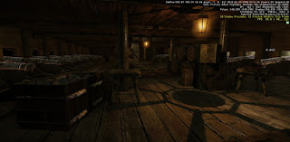
Lots of work on the lower gun deck, added everything from plates and cutlery, to cannon ropes, cleaning equipment and hammocks.

Used the old door mesh rather than making a new one for internal doors throughout the ship.

Not a whole lot done upstairs other than improving some earlier texturing.

Added a separate larger row boat and support structure for it based of reference that i took at the cutty sark.


Monday, 18 March 2013

FMP VIS AREA PROBLEMS.

Tried putting in vis areas after some feedback but due to how they work and the amount of portals i had they just wouldn't work how i wanted in the transition. Because of the shape of the ship there wasn't any way to stop the popping of visable areas and even after i had multiple meshes the level wouldn't save the changes and this would leave my ship being invisible. I'm now using inverse lights to reduce the brightness indoors to make it more realistic. I think i will model some hammocks and some crew related items in the cannon deck to bring it to life.


Sunday, 17 March 2013

FMP 13 PROGRESS

Progress for these week has been strong and the focus has been on adding some smaller rope details, working on critique given from the Polycount community and adding some of the harbour.
I've added the rope tie details this week and that was the focus for the beginning of the week, i created a set of rope ringlets that could be used around the ship and add some little details. These were created separately to the Tying rail so that i could swap out meshes and have more control for the aesthetics. As for the ropes that spurred from these locations i initially tried using rope entities. I hate rope entities. I had a lot of problems with the snapping not working and when i had finished placing a set they would later be found straddling the outer reaches of the level. Not quite sure why this happened and why it only happened to certain areas. This resulted me in having to create some static meshes that could be used for the areas that were not working to my satisfaction. I didn't get as much control as i would have wished because of this but i managed to position it in a way to show it in the best way. I had the problem that i had created to many rope ties and i wasn't entirely sure what they should do. From photos i could find of rigging it seemed some tied on to the ladder rigging and some controlled the tightness of the sails so i incorporated this into the design. I did remove some ropes as they had no purpose currently.

The railings were pulled out from the respective counterparts and used as the rope ties. I also changed the railings at the back of the ship to incorporate some details that locater16  had posted on my polycount thread. I lowered the sides and i'm going to create netting to straddle the posts as the project progresses. This will give the back a better aesthetics and interest that it currently lacks.

I've changed the cannon texture after feedback from polycount to be darker and more specular. It also has a hammered metal normal map that adds subtle detail. I've added metal to the outside of the wheel. The cannon may still require more work but for now i am fairly happy with how it has turned out.

The ship deck is looking a lot busier, this is something that i wanted from the beginning of the project, I've changed the resolution and texture of the mast so it has more pixel density. I added wood detail on the advice of Rich Cary. This has given it more interest and it isn't so uniformly red now which is much more natural and pleasing. I've also added some lanterns to the ship so i could put in some light sources and interest for the ceilings of the ship. I'm not sure if i'm happy with the final shape or texture as for now it is using a slightly modified metal texture. But for now it will remain the same, I may consider making it a different shape. It is using a cruciform to create the ambient glow and an emmisive texture to create the candle effect and the light flame. Because of the limitations of Cry i couldn't create a flickering texture or flip book texture flame as i would have in UDK but apparently i can do something similar but i have yet to research this.


I've darkened the interior space to be slightly more realistic but still light enough to see. I may create a fog volume to add some atmospherics to this. I've also added some rope piles to place around my level to break up the floor.


This week i created the harbour tie set and the wall. This swapped out the blockout mesh and allowed me to put some added decals to break up the detail. I added some high and low platforms and a walkway and stairs to navigate along the harbour. I want to add some diagonal support structure underneath to add visual interest. The harbour wall uses vertex painting to created a mossy recessed wall and a less damaged grout filled wall. I created two new decals to compliment this extension to the project. One is an algea texture to break up the transition and add some colour and another is a seaweed base decal for the lower reaches of the wall to add a black frame and rest zone for the players eyes.

Sunday, 10 March 2013

FMP 11 PROGRESS

After feedback from Mike and Heather this week, i acted upon changing the shape at the front of my ship to be more authentic. I agree that it looks a lot nicer now and has a much better aesthetic. I had a few issue with the cry engine exporter not working as it wasn't exporting the material ID's with the mesh. I think this must have been the scene just not exporting properly any more as this had happened to a few of the other people using Cry in the third year. I fixed this by moving it to a new scene and re-exporting the mesh. 

I've done a few little changes that have really brought together the scene over the weekend. These included adding the plaque's around the ship and adding some rope geometry to break up the mast along the ship. I've added the door to the interior which I've made red to accompany the accented main mast. This has added more colour to the ship and is starting to make it seem more interesting instead of just wood and rope.

I added the ship bell to the rear section of the ship, this adds a focal point to this section of the ship that was other wise lacking any details. I've added green and gold highlights in the bell to add more colour and vibrance to match the gold plaques.

I've broken up the floor some more with some wooden slates to go over the metal grating. This would have been the method to stop water flooding the ship and it also breaks up the floor and adds some subtle details that the ship was missing here.

The golden plaque design was based upon the plaque of the HMS Surprise replica ship, using this as a template i changed some of the rear details to make it my own and had the two mermen in embrace to signify  the relevance to the ships name. Feel deep respect or admiration for.

I also worked on the interior space by breaking up the flat surfaces and tilling with supporting struts along the ceiling and along the rib cage sides of the ship. I've also added some hatches to the unplayable lower deck. This area would have been used for additional storage and possibly other areas the crew would have inhabited. For now i've blocked the rear area of the lower deck from the player to confine the playable area. This would have contained the ships galley and crew accommodation. I'm not sure if i want the top playable section to have the galley, as this would make more sense seeing as the dining room is here.


Friday, 8 March 2013

FMP 10 PROGRESS

 Presentations this week so i was trying to push the amount i could show for the time i've spent, being around the half way point i would have liked the ship to have been relatively finished. To some degree it is, as i just have to work on some internal areas and a few additional assets. I'm happy with how the ship looks at the moment and i don't think there is a whole lot i want to change drastically.

This week i worked on texturing the last big piece of the ship the balcony back area, trying to make the windows not feel so massive was overcome by adding some blue wooden areas and the supporting orange pillars.

I also started working over the original tiling textures that covered the flat wall areas, these weren't really working and I thought some panelling would better display the area and make it more interesting. I still need to add the doors and some small assets such as lanterns which i think will bring the ship to life a bit more.

 I texture the capstan that had been painfully untextured since the dawn of this project. Trying to make it interesting was a little difficult, so i looked at some of the other assets i had produced for the ship such as the barrels and used these to draw on as reference. I created metal bands to break up the silhouette and i added the rope twist at the bottom. I also added the third of the latin phrases that incorporate the ship.

I toned down the saturation to match the texture fro the rest of the ship and got rid of some noisy and un-tilling details on the texture. still having some issues with the blue wood colour even though i added the exact texture from the tilable wood. I reckon i might go over that texture and play with the specular to see if that changes anything.

I added the glass into the model of the balcony as a multi-sub material. Originally I had the frame and the glass as the same material ID but i couldn't use the glass shader then and the illum shader wouldn't show my alphas properly due to a current cry engine issue. So i took the planes back into Max and had to model and assign separate ID's for the metal and glass in the same model. It added a lot of tri's but this was the easiest way of getting the cloudy and distorted effect I wanted for the glass.

I added a block out for the harbour town area, I'm aiming on having only a small playable area on the water front yard and using LOD building modules to create a sprawling town behind the main buildings. I'm still debating whether to have a market in the area. I'm having a fort to the rear of the ship to guard the harbour entrance and this area won't be playable.

This was a quick concept that i produced to show what sort of area i wanted to have.

Sunday, 3 March 2013

FMP 09 Progress

The ship has come along leaps and bounds this week and i've never been so in too a project this far in. I made up for the time i lost a few weeks back and i've worked on improving the silhouette and realism of the ship, rather than moving away from something i was enjoying and progressing so quickly on.
This was the stage i was up to at around Wednesday  i'd put a lot of the base textures on my assets to get a feel of scale for the tillable and whether the colour pallet was working and if there were any noticeable problems. I had to re-unwrap the hull as there was some texture stretching from some additions i had added through this week. 

I also made use of some basic decals to break up the tillable textures and add more texture variation and colour. I used a leaking decal as well as two wood variation textures. I also down sized all of my original textures as i was still using the TIFF files in many cases instead of the downsized DDS files. This literally didn't affect the texture resolution at all which i was really surprised at, i think this was because they were being reduced in engine anyway.

This was the ship as of about an hour ago. Just looking at difference you can see i have broken up the hull with steps, ive added in the cannon hole flaps which breaks up the silhouette even more and brings it away from looking repetitive. I've worked on the rigging and the mast a lot this week. I've broken up the colours with some red on the central mast. I reckon i might add some sculpted details, such as lantern holders and rope ties around the masts. The rigging was unwrapped properly this week and i've managed to use my rope textures for both the new smaller rope and the older thicker ropes by using colour grading in the diffuse in Cry. I'm aiming to break up the ship and bring it to life even more by adding the rope tied areas and maybe have some broken parts. 

It was this week that i considered the option that this ship was in for minor repairs and i might have areas with fresh paint decals and paint buckets on the rigging supports. I still need to model and bake down the rigging pully's to give them more definition as they are currently using another textured area of the rigging unwrap. The front of my model got some TLC this week and ive added some support joists and a more interesting silhouette and appearance to the front sections. I'm aiming to have some more fine details in these areas as well but that will progress when i get to a further stage.

I'm still not completely happy with the railings around the ship and i think i'll have to go back to these at some point and try to break up the repetitiveness of them. Maybe use some rope rigging on some areas or have some more intricate pieces at ends and bends.

One area that i focused on this week was the interior, being at least a month in to this project means that i should at least have a block out and i'd had enough of making myself put it off. I white boxed it in max and tried to get the right shape and size of rooms and assets. I'm aiming on having the captains quarters and the first and second's mate area playable. I had to go back between max and cry a few times to scale chair and tables down to give them the right look but other than this i didn't run into a lot of problems. The inside of the ship was changed to incorporate flat sides to allow furniture to fit easily and i added portholes to the rooms to add a bit more light and break up the walls. 

I'm glad a white boxed it as it gives me a clear understanding of what is needed in the rooms and how long i should spend on it. I want the interior to be a main focal point of the ship so it needs to look the best i can manage. I produce a grey scale paint over to give a sense of what i wanted to achieve in doors and it also give me a very quick and easy way to concept.

The exterior is back, broke up the flat pieces with planks and i think i've blocked out the final size and layout for the overhang part of the harbour. I want to have a few boxes and barrels waiting to be delivered or loaded. I might see how feasible it would be to have a crane lifting a cannon onto the ship but i have to consider the time constraints for the project.

I added the interlacing of the rigging and my oh my it was expensive, i used 5 sided ropes and it came to 53k of roped rigging. Didn't have any visible negative effect on the frame rate for my level so its staying, and it seems like the only way i would be able to make it look good.
Other notes would be, need more cool colours, i toned down the blackness of the shadows which helped a little and also made areas more visible. I might have the cool colours coming from the sure. The whole beacon in a dim world thing going on.